
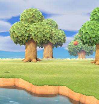
We were given a choice of various games, all ranging from different genres, art styles, and play styles. The game we chose was the one we worked on for the duration of the course, as if we were designing from scratch.
For my class project, I chose Animal Crossing: New Horizons as its a game that I'm very familiar with and spend a lot of my free time playing, I was very excited to work on it and add my own spin to the UI.
ACNH is a sims like game with cozy vibes where you inhabit and create your own island. You can decorate your island, change the landscape, and invite villagers from far away islands to come live with you.
Animal Crossing: New Horizons


Overview
Over the course of those 7 weeks, I learned and applied:
Concept of UI/UX & how it can be implemented into video game design,
Player Profiles
Paper Prototypes
Flowcharts
Wireframes
UI mockups
All of these topics were explored in depth and with assignments curated for each topic.
Challenges
Time Frame
7 weeks
2-4 hours on each assignment every week
Being creative to create an intuitive to create a UI for an existing game
Learning and getting used to new software
Photoshop, PS Illustrator, Figma, etc.
Working efficiently to meet deadlines
Road Map
1. Player Journey
2.Paper Prototype
4.WireFrame
5.Usability
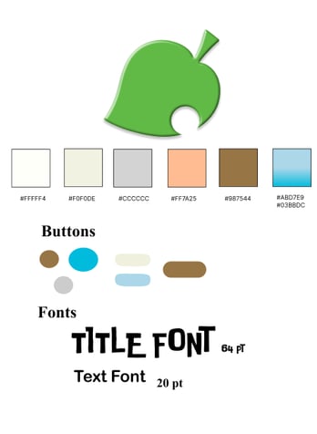
6.UI Style Guide
8.Accessibility Testing
3.FlowChart
7.UI Mockups
Player Journey
The first phase was the Player Journey.
Descriptions of gameplay was given to us by a "Game Dev".
From watching gameplay, I collected screenshots that matched each description and took notes on what the players hear/see, what players think/feel, what decisions players made and why, and any opportunities to boost user experience.
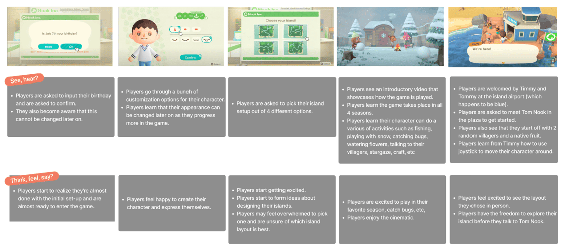
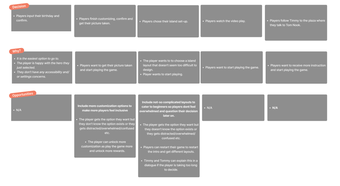
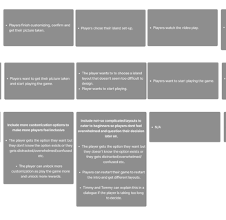
Players can create birthday that is not editable later.
Players can create their in-game avatar (take a photo).
Players can choose their initial in-game setup and island.
Players know how the game will play, in-game characters and what they can/might do.
Players know they have arrived to the island. Players know what to do.
Paper Prototype
The next step was the Paper Prototype.
I took the same game design instructions that were first given to me by the Game Developer/Designer and used those to create a draft of what kind of screen the player would be seeing. This is essentially creating and establishing the options each screen would have and flow between the screens, further increasing the user experience.
Introduction Screen
Customization Screen
Welcoming Cinamatic/Cut Scene
Cut Scene
Gameplay
Players know what to do.
Timmy and Tommy tell the player to meet and speak to Tom Nook in the Plaza.
Player has the chance to explore the island.
Players know how the game will play, they learn different in-game characters, and what their own character might/can do.
Players know how the game will play, they learn different in-game characters, and what their own character might/can do.
Players know how the game will play, they learn different in-game characters, and what their own character might/can do.
Players know how the game will play, they learn different in-game characters, and what their own character might/can do.
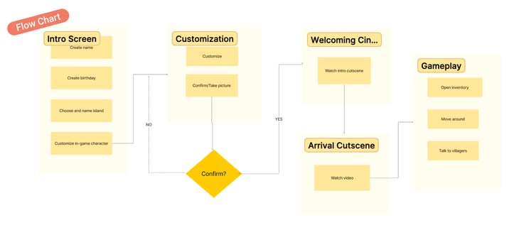
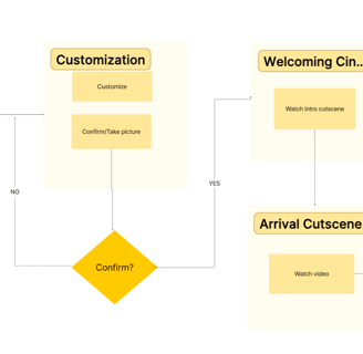
Next step was creating the Flow Chart.
This is to show the flow between screens. It also gives me an idea of what each screen should consists to ensure smooth gameplay and mechanics.
Flow Chart
WireFrames/Testing
Next step was creating the WireFrames.
This was to establish the layout of certain screens I decided to recreate and making sure to use the flow chart to achieve a seamless implementation.
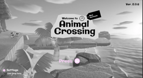
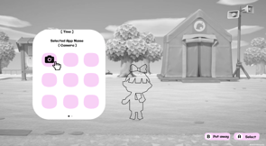
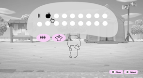


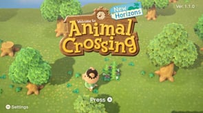
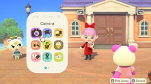
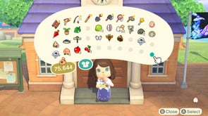


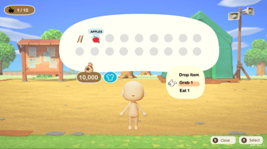
Using screenshots from the original game as reference, I designed my own screens using elements from the original but still making it my own. Keeping it basic with the color palette and using a pink accent color to indicate things the player could interact with. Using an outline of the player model, I judged the space needed for the inventory and phone.
First Iteration - ( Low Fidelity )
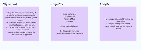
A usability test was run on the first iteration. This test essentially tested the efficiency and learnability of the wireframe for new players who have never played this type of game but also seasoned players.
Can players understand all the options without assistance? If no, why?
How do players feel about the design on the screens.
Iterate design based on the usability test feedback, if applicable.
These are the type of questions that are asked to test the wireframes and curate the game experience.
Usability

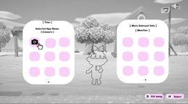
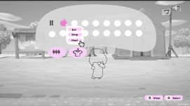


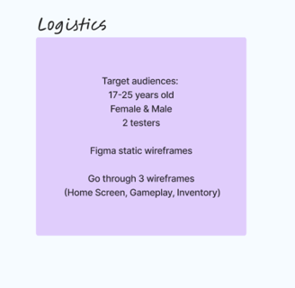
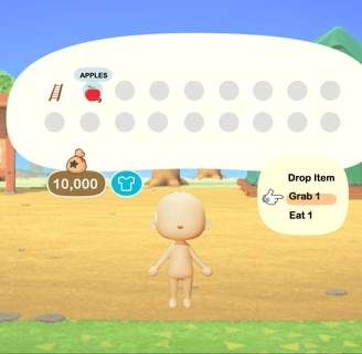
For the second interations, I made improvement based on feedback from my 2 testers. The main home-screen didn't have any applicable changes. For the phone screen, I made it so more information was visible on the right side. For the inventory screen, I made it so players could see what their options were when they would click on something in their inventory.
This is where Bobs' comment struck. I realized that they didn't know the apple was interactive so I went back, changed the color to pink, to match the other buttons, and showed the players the options they had with said apples.
With the testing, first and second interations done, I was ready to move forward and create the high-fidelity wireframes and the final version of the UI.
Maria
By having players who weren't familiar with Animal Crossing but with other games, I was able to test efficiency and learnability of the wireframes(s). It wasn't too hard for players new to ACNH to tell what they were looking at/their options. At the same time. it wasn't too simple for those more "experienced" players in other genres to pick apart.
Conclusion
Not an avid gamer in general
Never played Animal Crossing but has played Sims/GTA.
Can you identify each screen?
Can you tell me what you see on each screen?
home screen
some type of phone
storage
phone
only option is the camera
money
clothing
3 apples
ladder
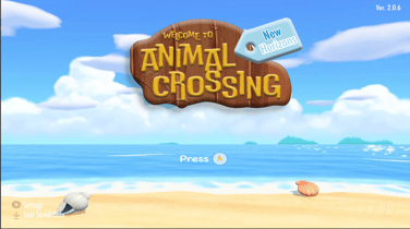
name of the game & version
the settings
last save
beginning of the game
Bob
Is an avid gamer for more FPS and RPG games.
Never played Animal Crossing.
starting screen
cellphone
inventory
trees and beach( location in game )
name of game and version
settings
interactive button
cellphone
current app is "camera"
"looks like a second page and the more you play, the more apps you get"
currency
clothing
apple/apple trees
ladder
FeedBack/Extras
Bob noticed how some buttons were pink and not grey/white/black. They went forward to conclude that those were indeed interactive.
Their feedback was the following:
- Extra space on the right in the cellphone screen.
- See what options you have for items in inventory
Second Iteration - ( Low Fidelity )
High-Fidelity Wireframe
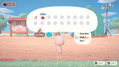
Green Weak Deuteranomaly
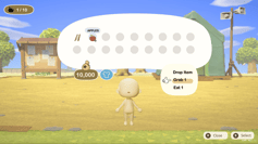
Red Weak Protanomaly
Blue Weak Tritanomaly
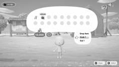
Monochramacy Achromatopsia
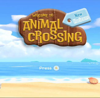
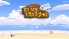
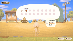
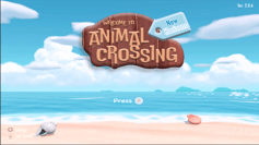
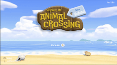
The final mock-ups were created in Adobe Photoshop & Illustrator, respectively.
Accessibility testing for color blindness was also conducted to test the color palette and changes were made if necessary.



UI Style Guide
Results
With little to no experience in UX/UI design and various software, I was able to mimic but still putt my own twist to a UI for a game that already exists and one that I am familiar with.
This course and project gave me the ability to understand what does goes on behind the scenes when it comes to designing interface for video games and what the process looks like.
I understand the importance of working with others to communicate the direction the game should be heading in, in terms of design.
I learned the process of conducting various tests and research to make games more accessible, fun, and inclusive for players everywhere.